

Save‑A‑Lot has launched a Fresh Cut Meat campaign, spotlighting the retailer’s commitment to providing customers with fresh, quality meat cut in-store. The campaign highlights a key point of difference from other national grocery chains: Save‑A‑Lot cuts meat fresh in‑store. At stores nationwide, trained meat cutters prepare select beef and pork products daily. “At Save‑A‑Lot, we […]
Category: Marketing News

Posted inOnline Grocery Technology, Featured News, Giant Food, Marketing News, News, Northeast
Giant Eagle Taps Ibotta As Exclusive Digital Promotions Partner
Giant Eagle Inc. has selected Ibotta as the provider of digital promotions across its 200-plus supermarkets and platforms. The partnership represents a step forward in the Pittsburgh, Pennsylvania-based grocer’s “Because It Matters” business strategy, a multi-year plan centered on delivering better everyday value and a modernized shopping experience. By integrating with the Ibotta Performance Network, […]
Posted inIndependent Store News, Hy-Vee, Marketing News, Midwest, News
Hy-Vee Boosts Support For Veterans, Active-Duty Members For America 250
Hy-Vee stores are supporting the country’s military veterans and active-duty service members through several Hy-Vee Homefront initiatives, part of the company’s broader celebration of America 250. Starting May 1, Hy-Vee customers can round up their purchases to the nearest dollar throughout May to support organizations that serve veterans, active-duty service members and their families. The […]
Posted inOnline Grocery Technology, Marketing News, News, U.R.M. Stores, West
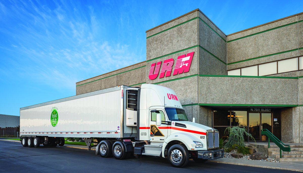
RSA America, URM Stores Begin Digital Transformation Partnership
RSA America has partnered with URM Stores Inc., a Spokane, Washington-based retailer-owned wholesaler supporting about 265 independent grocery retailers across the Pacific Northwest. Through the partnership, URM is deploying a centrally managed loyalty, digital marketing, retail media and artificial intelligence-enabled commerce platform designed to provide enterprise-level intelligence and execution capabilities to retailers of all sizes. […]

Posted inMarketing News, Featured News, National, News
Dear Marketers: There’s No ‘Average’ Grocery Shopper Today
These days, there is no such thing as the average grocery shopper. That’s according to three research reports released April 30 by media agency Schaefer that separate shoppers into social-first, TV-first and streaming-first food and beverage buyers. “These three categories of buyers are not a spectrum. They are three structurally different advertising problems, each one […]

Posted inMarketing News, Grocery Research, National, News, Retail Media
Dunnhumby Research Shows Evolving Customer Perspective Of Retail Media
Nine in 10 shoppers are open to more retail media experiences, but only when the ads are personalized, according to new research from dunnhumby. The study of UK and U.S. shoppers found that demand for personalized advertising is high, yet its effectiveness depends on how well retailers and brands deliver relevant, timely and trusted messages […]
Posted inMarketing News, Featured News, News, West
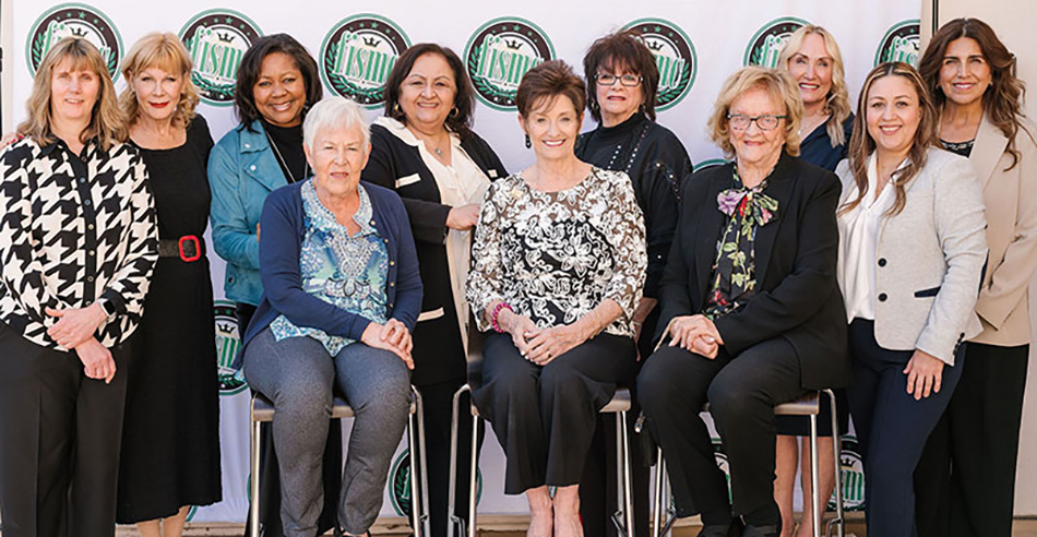
FISMC Women In Food Event Raises $8K For Olive Crest, UNFI Foundation
The Food Industry Sales and Marketing Club held its annual Women in the Food Industry event March 10 at Anaheim Hills Golf Course, raising $8,000 for industry charitable partners while recognizing two leaders – Rhonda Tagge of Olive Crest and Jennifer McDonald of UNFI – whose work continues to impact the grocery industry community. Through […]
Posted inOnline Grocery Technology, Albertsons, Marketing News, News, West
Albertsons Media Collective Introduces Onsite Incrementality Measurement
Albertsons Media Collective, the retail media arm for Albertsons Companies Inc., has launched an onsite incrementality measurement, a new capability designed to help advertisers better understand the true impact of their retail media investments. As brands increasingly prioritize incrementality as a key performance indicator, the solution provides insight into how onsite display media is driving […]