
Morton Salt is launching a year-long campaign in honor of the Morton Salt Girl, who marks her 100th year as the face of the brand in 2014. Morton Salt also is refreshing its brand this year by updating its logo and introducing a new packaging design system.
“This is a milestone year for Morton Salt,” said Christian Herrmann, CEO of Morton Salt. “With the Morton Salt Girl’s centennial and our Morton brand refresh, we have two major reasons to celebrate our past, present and future.”
It was 1914 when the little girl with the umbrella was introduced on the familiar blue round package of Morton Salt and in a print ad in the October issue of Good Housekeeping. The Morton Salt Girl and “When It Rains It Pours” slogan were created over a century ago for the company’s national advertising campaign to help illustrate that Morton Salt could flow freely even in damp weather, a major product innovation at the time. Since then, she has grown to serve as a trust mark on a full range of Morton Salt products for consumer and industrial uses. And she still remains a source of inspiration, according to Morton. Even after 100 years, her appeal has stood the test of time as she continues to be brought to life by children and adults in parades, at costume parties, in school art and science projects and in social media.
“The Morton Salt Girl has been a staple in hearts and homes all across America for 100 years,” Herrmann said. “And she’s still the one that people trust to be part of their life experiences. That’s because she is more than just a symbol of our brand. She’s an American way of life.”
Brand refresh
Like its iconic Girl, Morton Salt has been a symbol of Americana. After 165 years, it is one of the country’s oldest and most well-known brands still today. But even iconic brands need an update, Morton says.
“Morton Salt has evolved as a business and a brand since introducing that familiar blue package of table salt over a century ago,” Herrmann said. “Today, we’re enhancing everyday experiences in more ways and places than ever before through a full range of culinary salts, ice melters, water softening products, Epsom salt and even salts for business and industry.
“To help signal the company’s continued growth, this milestone year was the perfect opportunity to refresh the Morton Salt brand with an updated logo and packaging design system,” he added.
Logo
The Morton Salt logo is widely recognized for its bold “Morton Salt” word mark. The new logo now features a fresh and friendly font, while maintaining the leadership qualities of the original word mark, specifically the bold, all-caps type style. The letter “R” in the new “Morton” word mark also carries a slight kick to mimic the Morton Salt Girl’s step.
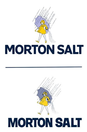
In addition to the word mark, the company updated its Morton Salt Girl icon as part of its brand refresh—but in small, subtle ways. The new Morton Salt Girl has cleaner, simplified linework to fit better with the new “Morton Salt” word mark.
“We constantly listen to consumers to ensure that we continue to meet their changing needs,” Herrmann said. “Through our latest market research, we know that the Morton Salt Girl is synonymous with the brand and her timeless, classic look still resonates with consumers today. However, we also knew there was an opportunity to make the brand look and feel more modern and approachable.”
Packaging
Along with the new logo, Morton Salt also is rolling out a new package design system for its consumer products, starting in the first quarter of 2014. The new design system preserves the iconic elements of the Morton brand, while using contemporary fonts and simpler communication hierarchies.
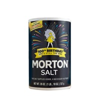
The new design system will be applied to all Morton consumer products. For Morton’s iconic Iodized and Plain culinary salt products, in 2014 only, the company is featuring the new Morton logo with a birthday graphic treatment in honor of the Morton Salt Girl’s 100th birthday. This limited edition packaging will be sold in retail and grocery stores nationwide.
Morton Salt also is marking this milestone year with the first of many new product innovations to come. In 2014, the company is launching two products: Morton Garlic Sea Salt, an industry first; and Morton Sea Salt, Roasted Garlic Sea Salt and Black Peppercorn Grinders in stylish, table-top-ready glass bottles. These products will be available nationally this year.
In the feature photo at top: Morton Salt is rolling out a new package design system (top) for its consumer products in 2014. The new design system preserves the iconic elements of the Morton brand and uses contemporary fonts and simpler communication hierarchies than the previous packaging design (bottom).


2 Comments